Table of Contents
Case Study
Case Study
PATHWAY
PATHWAY
Reading Time:
Reading Time:
7 Minutes
7 Minutes
Project Type:
Capstone, BrainStation Diploma
Time Line:
Oct - Dec 2024
Role:
UX Designer
Tools:
Figma
Outcome:
IOS Mobile App
Project Type:
Capstone, BrainStation
Role:
UX Designer
Tools:
Figma
Outcome:
Mobile
Time Line:
Oct - Dec 2024
The Challenge:
The Challenge:
New Policy, New Pressure
New Policy, New Pressure
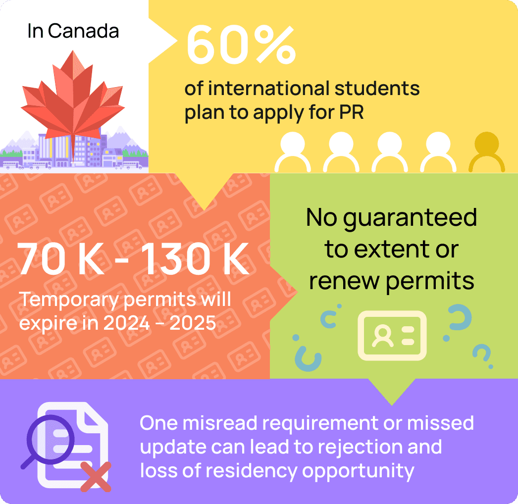
Canada's new Immigration Levels Plan (2024–2026) opens more PR spots, but also introduces stricter, skill-based eligibility that changes every year.
For international students, this creates uncertainty, stress, and confusion in an already complex process.
Canada's new Immigration Levels Plan (2024–2026) opens more PR spots, but also introduces stricter, skill-based eligibility that changes every year.
For international students, this creates uncertainty, stress, and confusion in an already complex process.

Why It Matters:
Students Are Falling Through the Cracks
Why It Matters:
Students Are Falling Through the Cracks

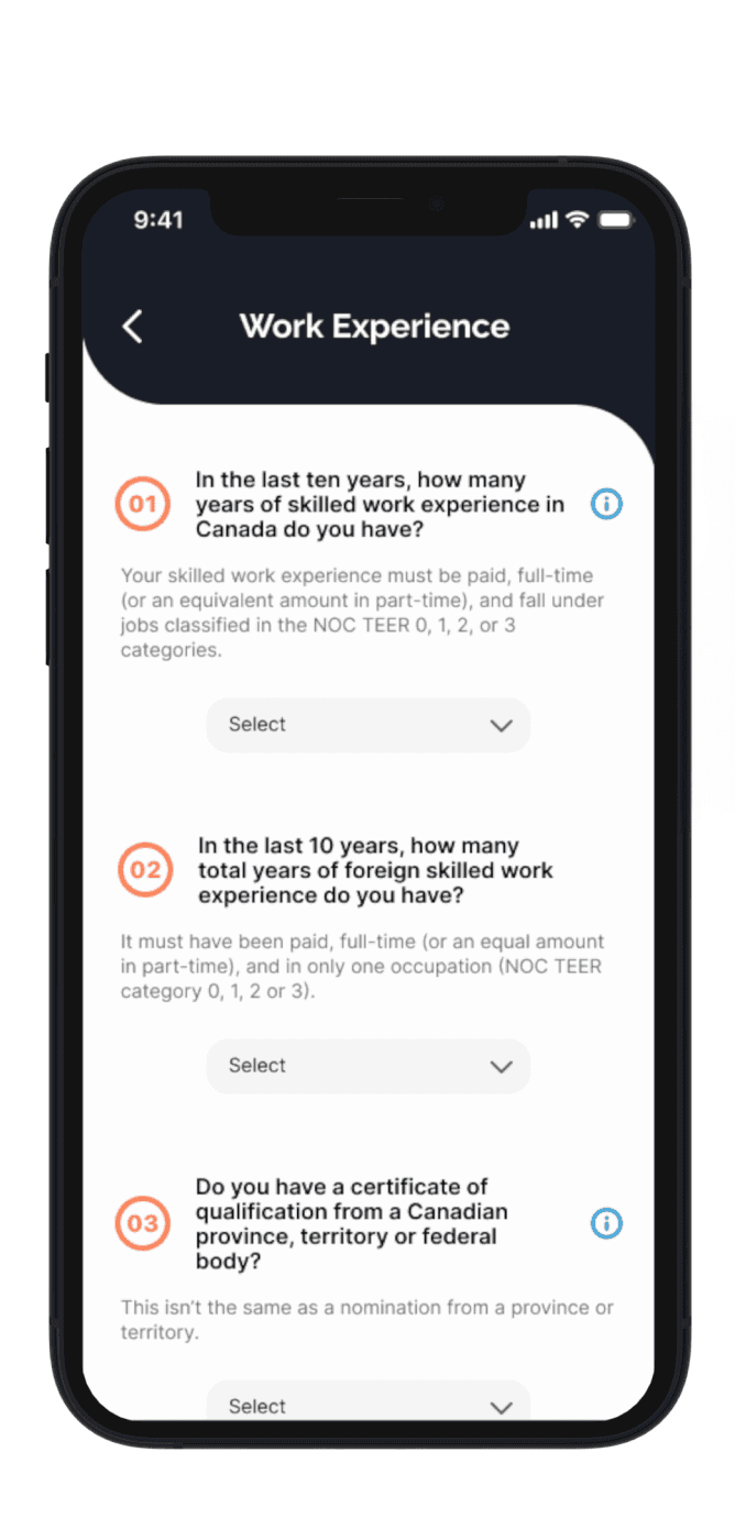
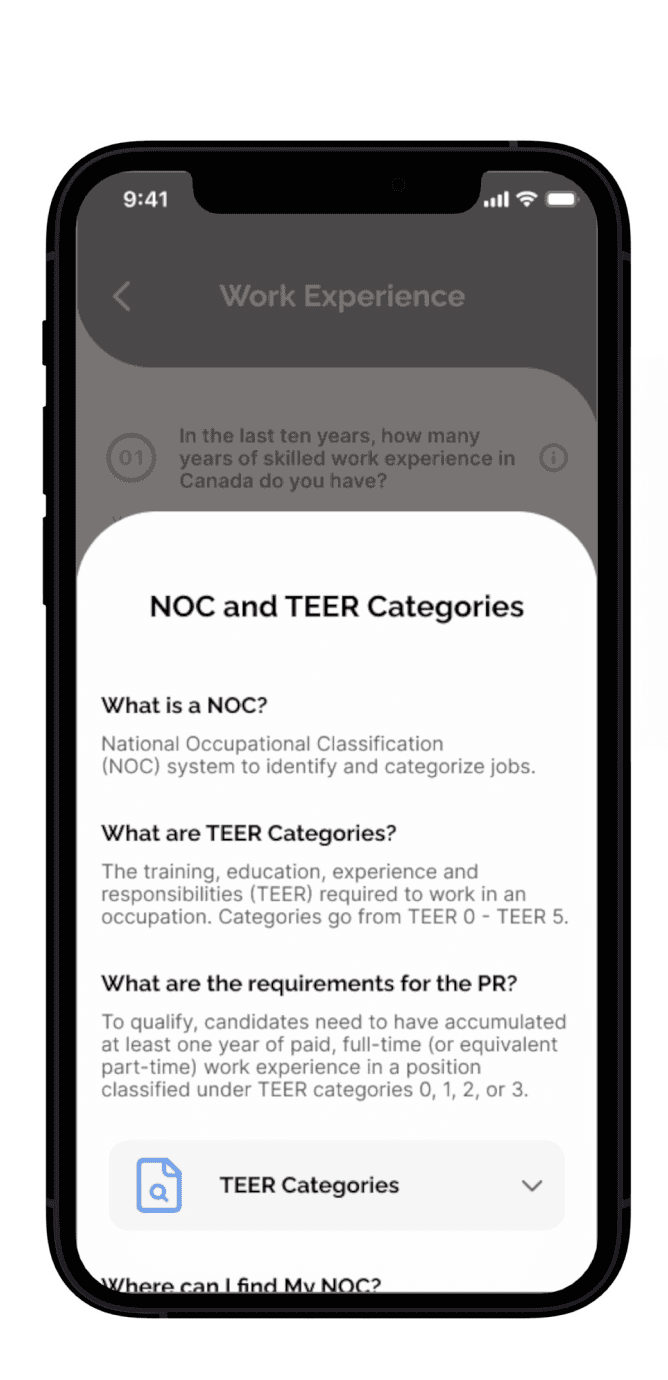
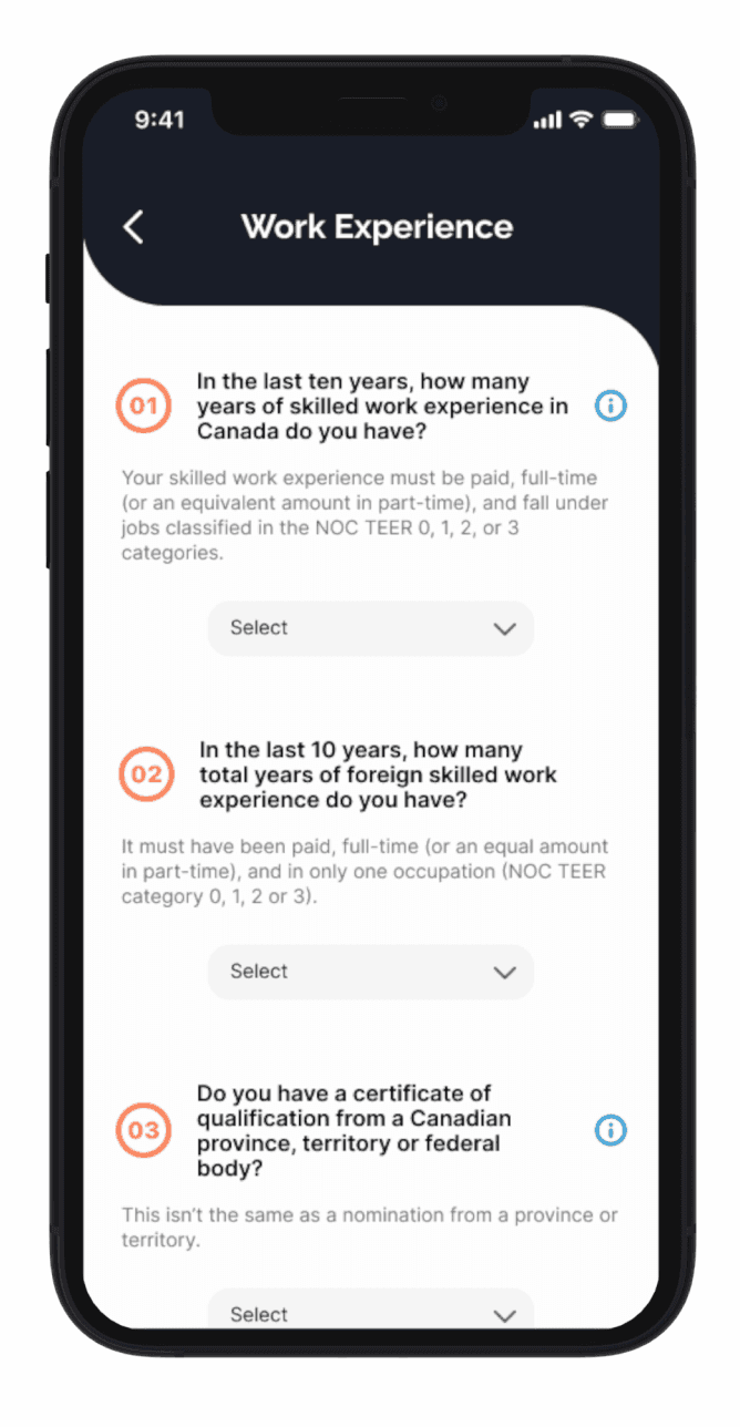
Eligibility Questionnaire
Simulates the real CRS tool to help users accurately assess their eligibility points before applying.
Tools to Understand the Process
Provides tailored guidance to answer questions correctly, reducing errors, delays, or rejections.

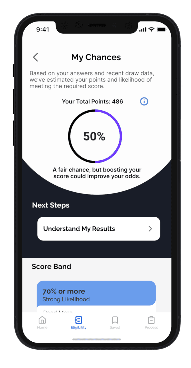
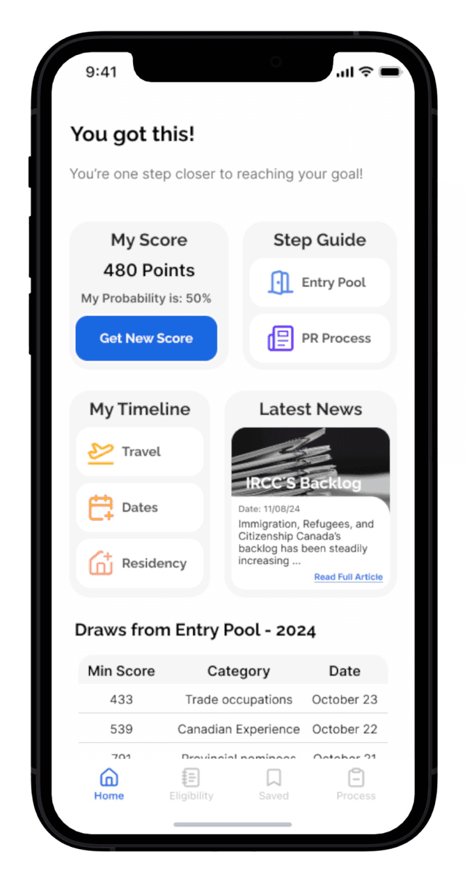
CRS Score
See where you stand and how close you are to eligibility, using up-to-date draw data.
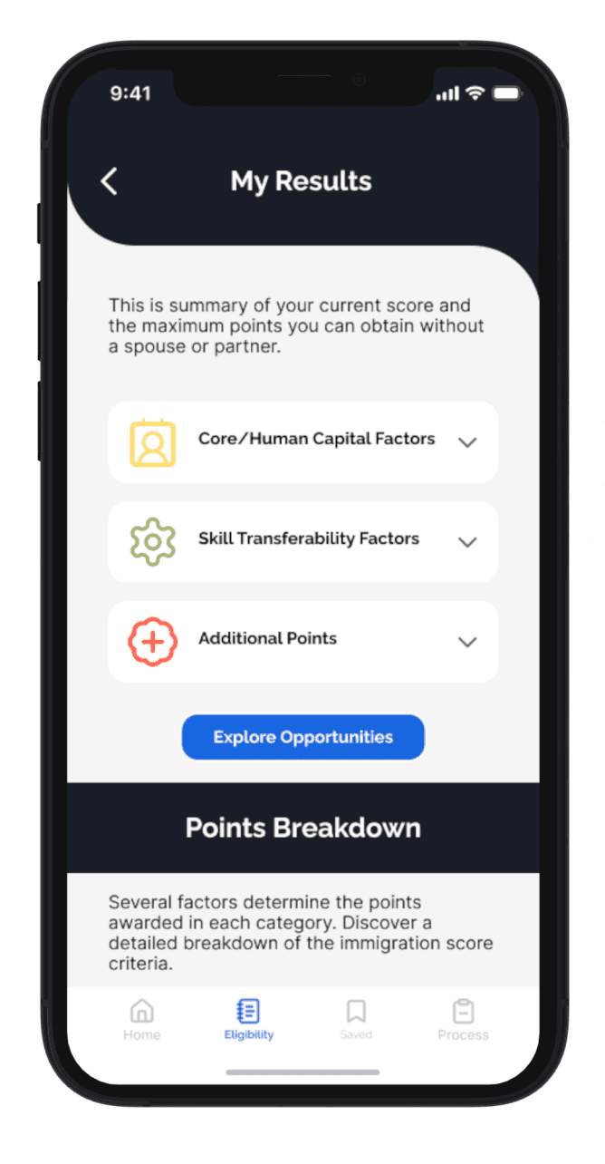
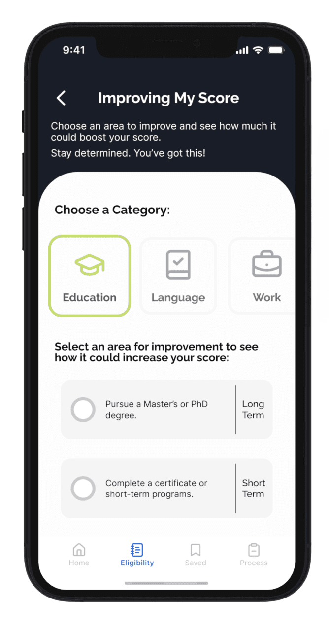
Score Boost Tasks
Get personalized actions to increase your score, with estimated impact included.
Eligibility Questionnaire
Simulates the real CRS tool to help users accurately assess their eligibility points before applying.
Tools to Understand the Process
Provides tailored guidance to answer questions correctly, reducing errors, delays, or rejections.
CRS Score
See where you stand and how close you are to eligibility, using up-to-date draw data.
Score Boost Tasks
Get personalized actions to increase your score, with estimated impact included.
Designed to Solve:
Key Features that Makes Pathway Work
The Solution: Pathway, a Guiding Tool
A mobile app that helps international students:

Understand PR Application Process and where they stand today
Helps to avoid common mistakes


Explore ways to improve their CRS score and eligibility

The Solution: Pathway, a Guiding Tool
A mobile app that helps international students:
Understand PR Application Process and where they stand today
Helps to avoid common mistakes
Explore ways to improve their CRS score and eligibility
Designed to Solve:
Key Features that Makes Pathway Work
Eligibility Questionnaire
Test your CRS score in a stress-free way, no official forms or government pressure.
Step-by-step guidance.
Navigate each stage with timely, relevant info, reducing errors and search time.
CRS Score
See where you stand and how close you are to eligibility, using up-to-date draw data.
Score Boost Tasks
Get personalized actions to increase your score, with estimated impact included.

Step 1: Research
Step 1: Research
Getting the full picture
Getting the full picture
Before jumping into solutions, I needed to understand what makes the permanent residency (PR) process so complex for international students. I conducted primary and secondary research to uncover pain points, needs and possible patterns.
Before jumping into solutions, I needed to understand what makes the permanent residency (PR) process so complex for international students. I conducted primary and secondary research to uncover pain points, needs and possible patterns.
Maximizing Research Impact
Maximizing Research Impact
To gain a wide and balanced perspective, I interviewed two key user groups:
To gain a wide and balanced perspective, I interviewed two key user groups:
Group 2
Permanent Residents
Group 1
Recent Graduate
Focus:
Understand the confusion, stress, and knowledge gaps students face at the very start of the process.
Why Both Perspectives?
By combining both perspectives, I could uncover blind spots I wouldn’t have caught by interviewing just one group.
Focus:
Uncover misconceptions, regrets, and key mistakes that are only understood after completing the process.
Group 1
Recent Graduate
Group 2
Permanent Residents
Focus:
Understand the confusion, stress, and knowledge gaps students face at the very start of the process.
Why Both Perspectives Matter
By combining both perspectives, I could uncover blind spots I wouldn’t have caught by interviewing just one group.
Focus:
Uncover misconceptions, regrets, and key mistakes that are only understood after completing the process.
Organizing Inights into Themes
Organizing Inights into Themes
To make sense of the interview data, I used affinity mapping to translate quotes and observations into themes.
To make sense of the interview data, I used affinity mapping to translate quotes and observations into themes.
Eligibility Misunderstanding
“You need to be very careful on how to answer questions”
“First part It's a very simple questionnaire, very easy to get one question wrong, and one question can actually deduct some points.”
“My process was delayed for months because I didn´t know how to answer a question.”
Eligibility Pressure
“Now that things are getting a little bit tougher, I think it's important to really know what paths you can take.”
“I know that I'm not eligible right now, but what I don't know what would my score be if I do my best”
“To avoid getting my PR process delayed I had to prioritize meeting my requirements above anything else”
“Having someone that already went through the process really helps you.”
“I wanted confirm the new criteria, i tried to contact immigration for more information. But it took them too long to reply and in that waiting period the application was rejected..”
“Second time i applied I understood what some of the initial questions meant but missed the first time because of the wording.”
Getting the Right Answers
“Having someone that already went through the process really helps you.”
“I wanted confirm the new criteria, i tried to contact immigration for more information. But it took them too long to reply and in that waiting period the application was rejected..”
“Second time i applied I understood what some of the initial questions meant but missed the first time because of the wording.”
“Most of the information sources where from my acquaintances"
Getting the Right Answers
Eligibility Misunderstanding
Eligibility Pressure
“You need to be very careful on how to answer questions”
“First part It's a very simple questionnaire, very easy to get one question wrong, and one question can actually deduct some points.”
“My process was delayed for months because I didn´t know how to answer a question.”
“I thought I meet the new requirement.”
“Now that things are getting a little bit tougher, I think it's important to really know what paths you can take.”
“I know that I'm not eligible right now, but what I don't know what would my score be if I do my best”
“Even if i do everything right it might not be enough.”
“To avoid getting my PR process delayed I had to prioritize meeting my requirements above anything else”
Key Insights
Key Insights
These insights helped shape a deeper understanding of the PR journey and where users need the most support:
These insights helped shape a deeper understanding of the PR journey and where users need the most support:
Hidden Complexity
Many students underestimate how difficult it is to meet PR requirements, even before arriving in Canada.
Hidden Complexity
Many students underestimate how difficult it is to meet PR requirements, even before arriving in Canada.
Community Power
Applicants shared the value of support from others when finding accurate information about the process.
Policy Shifting
Changing rules create anxiety and doubt as permits are near expiration and eligibility remains unclear.
Critical Blind Spot
Most application errors happen in the eligibility questionnaire, often going unnoticed until it’s too late.
What This Told Me
What This Told Me
Users urgently need:
Clear, trustworthy guidance on how the system works
Confidence that they’re on the right track
Support around eligibility, where the stakes are highest
Users urgently need:
Clear, trustworthy guidance on how the system works.
Confidence that they’re on the right track.
Support around eligibility, where the stakes are highest.
Constraints & Design Considerations
Constraints & Design Considerations
To move forward, I needed to consider my role as a designer and the boundaries of what this product could (and couldn’t) do:
To move forward, I needed to consider my role as a designer and the boundaries of what this product could (and couldn’t) do:
Constraints
Solution can not offer:
Guarantee PR outcomes.
Provide legal advice.
It was essential to consider that I am not an immigration expert nor can I predict future immigration changes.
Opportunity
The solution could offer:
Clear and accessible information.
Actionable resources.
Guidance rooted in the latest policies.
Community insights.
The Solution Cannot
Guarantee PR results.
Provide legal advice.
Predict future policy changes.
The Solution Can
Accurate, accessible information
Personalized next steps
Community-based insights and guidance
Framing the Challenge:
How might we empower international students to feel informed in order to navigate the required steps for transitioning from study permits to permanent residency in Canada?
Framing the Challenge:
How might we empower international students to feel informed in order to navigate the required steps for transitioning from study permits to permanent residency in Canada?
Step 2: Define and Ideate
Shaping the Solution
With an understanding of user needs, I focused on who I was designing for and how to transform insights into features.
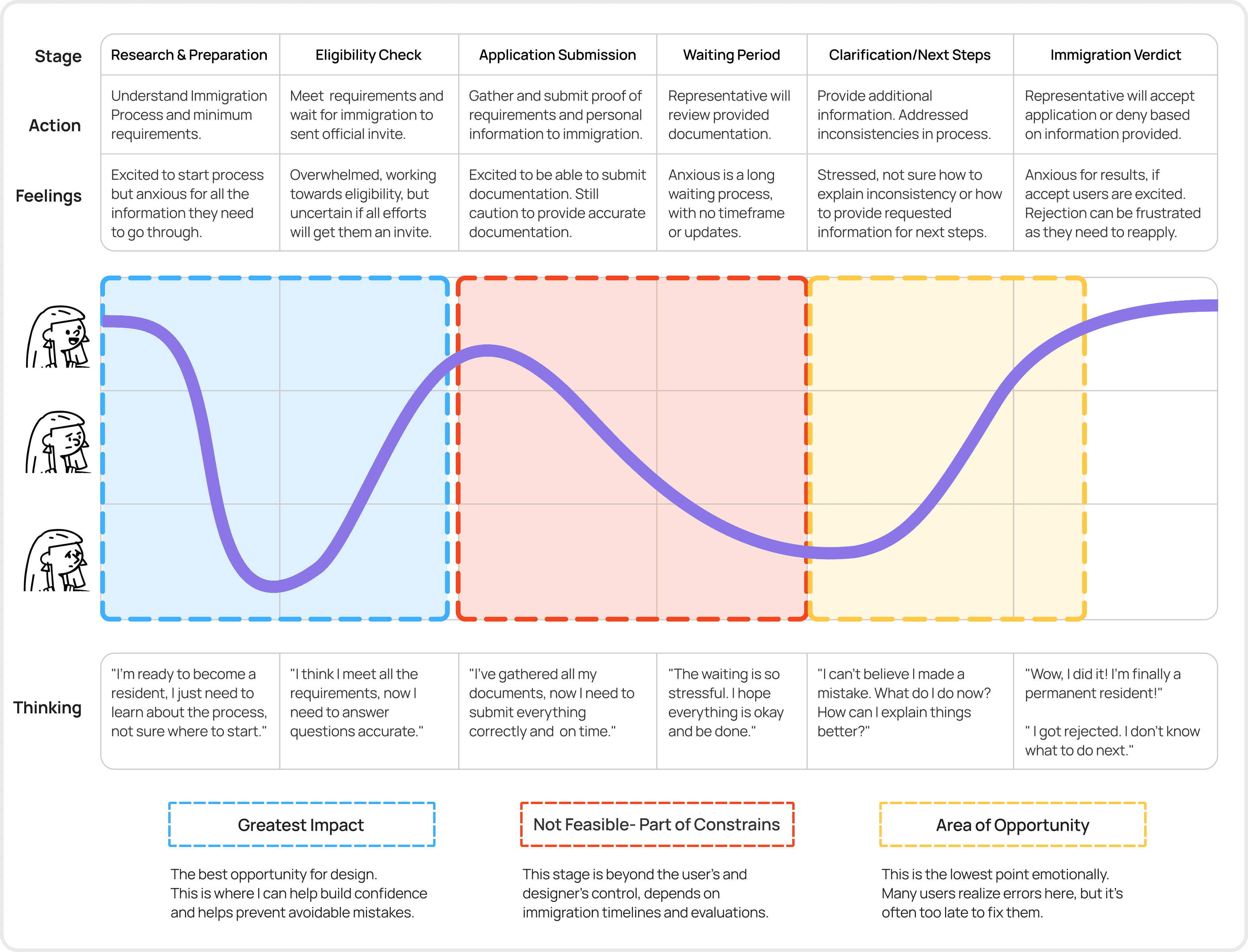
Understanding the Journey
By mapping the experience, I saw the highs and lows, turning the low points into design opportunities, while keeping the project’s constraints in mind.
Turning Insight Into Action: Defining the Core Features
Based on Natalia’s journey, I identified four epics that address users’ biggest challenges. These epics guided feature design and task flows, ensuring the solution aligns with users’ key needs.
Eligibility Insight
Community Insight
Records Management
Application Guidance
Why Focus on Eligibility Insight?
I chose this epic as the core experience because it directly addresses the "Critical Blind Spot" from user research and aligns with the opportunity area in the emotional journey.
This part of the journey happens before the formal application, making it the perfect moment to:
Help users start early and with confidence
Minimize application errors
Build a sense of control in a high-stakes process
Mapping the Journey
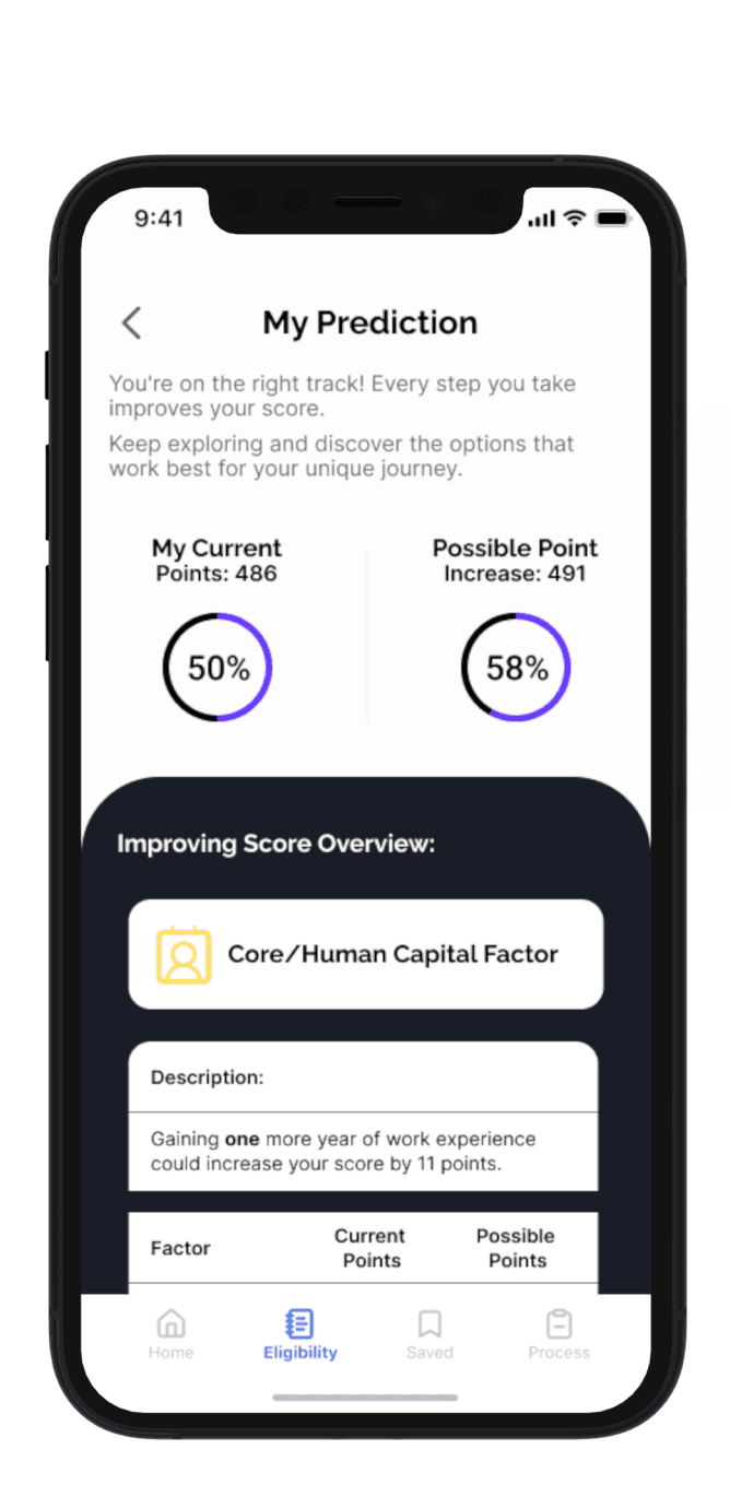
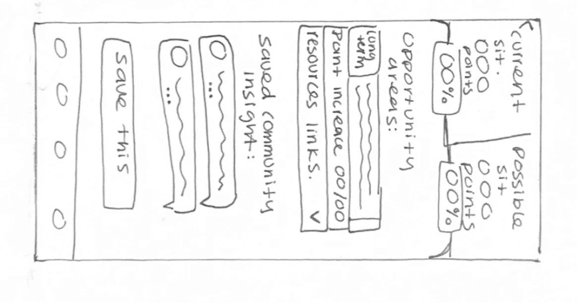
I created a task flow to support the Eligibility Insight epic, showing the key actions users would take after onboarding:
Profile could include:
User can input or update their profile details.
Click on icons to see detail on each question
Community insight, comments and insight that help users answer the questions
Profile could include:
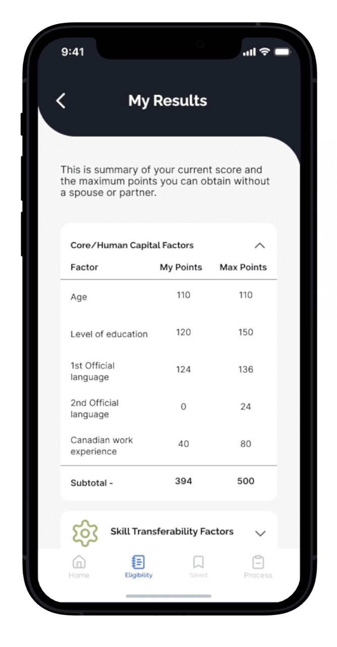
Users score overview with point system metrics.
User will see their probability of obtaining the PR based on recent data.
Let users know what to do next.
Recent Draw Cut-offs. Help users understand the current landscape.
Profile could include:
Prediction on how much their score could increase.
Resources to achieve point specific increase.
How long it could take to achieve them.
Profile could include:
Offer list of options on how to increase points on the long term and short term.
Access to community chat to read on what people are currently suggesting or what they did to increase their score.
Legend:
From Flow to Form
With the task flow mapped out, I grabbed a pen and paper and began sketching ideas.
Solution Sketches
Exploratory Sketches
Exploratory Sketches
Exploratory Sketches
Exploratory Sketches
Step 2: Define and Ideate
Shaping the Solution
With an understanding of user needs, I focused on who I was designing for and how to transform insights into features.
Understanding the Journey
By mapping the experience, I saw the highs and lows, turning the low points into design opportunities, while keeping the project’s constraints in mind.
Meet the User: Say Hello Natalia
Natalia Gomez
Graphic Designer
Age:
25
Bachelor's Degree
Education:
62 k
Income:
Toronto, ON
Location:
Single
status:
“I’ve worked hard to meet all the immigration requirements; it would be disheartening to miss my goal due to a preventable mistake”
Frustrations
Rejection due to inaccurate information.
Visa expiry prevents reapplication.
Uncertainty about point system score.
Fear of policy changes.
Stress from ambiguous outcomes.
Goals
Understand & master eligibility criteria.
Enhance application skills.
Navigate process confidently.
Spot and correct inconsistencies.
Monitor requirements and points.

Natalia represents international students at the start of their PR journey, motivated but unsure of what steps to take.
Her story helped pinpoint where users struggle most and where design could step in with clarity and support.Understanding the Journey
By mapping the experience, I saw the highs and lows, turning the low points into design opportunities, while keeping the project’s constraints in mind.
Meet the User: Say Hello Natalia
Natalia Gomez
Graphic Designer
Age:
25
Bachelor's Degree
Education:
62 k
Income:
Toronto, ON
Location:
Single
status:
“I’ve worked hard to meet all the immigration requirements; it would be disheartening to miss my goal due to a preventable mistake”
Frustrations
Rejection due to inaccurate information.
Visa expiry prevents reapplication.
Uncertainty about point system score.
Fear of policy changes.
Stress from ambiguous outcomes.
Goals
Understand & master eligibility criteria.
Enhance application skills.
Navigate process confidently.
Spot and correct inconsistencies.
Monitor requirements and points.
Natalia represents international students at the start of their PR journey, motivated but unsure of what steps to take.
Her story helped pinpoint where users struggle most and where design could step in with clarity and support.
Turning Insight Into Action: Defining the Core Features
Based on Natalia’s journey, I identified four epics that address users’ biggest challenges. These epics guided feature design and task flows, ensuring the solution aligns with users’ key needs.
Eligibility Insight
Community Insight
Records Management
Application Guidance
(Click on arrow to see details and user stories for each feature.)
Epics and User Stories
User Research & Analysis
Wireframing & Prototyping
User Interface Design
User Experiance Testing
Position #5
Position #6
Why Focus on Eligibility Insight?
I chose this epic as the core experience because it directly addresses the "Critical Blind Spot" from user research and aligns with the opportunity area in the emotional journey.
This part of the journey happens before the formal application, making it the perfect moment to:
Help users start early and with confidence
Minimize application errors
Build a sense of control in a high-stakes process
Mapping the Journey
I created a task flow to support the Eligibility Insight epic, showing the key actions users would take after onboarding:
Profile could include:
User can input or update their profile details.
Click on icons to see detail on each question
Community insight, comments and insight that help users answer the questions
Profile could include:
Users score overview with point system metrics.
User will see their probability of obtaining the PR based on recent data.
Let users know what to do next.
Recent Draw Cut-offs. Help users understand the current landscape.
Profile could include:
Prediction on how much their score could increase.
Resources to achieve point specific increase.
How long it could take to achieve them.
Profile could include:
Offer list of options on how to increase points on the long term and short term.
Access to community chat to read on what people are currently suggesting or what they did to increase their score.
Legend:
From Flow to Form
With the task flow mapped out, I grabbed a pen and paper and began sketching ideas.
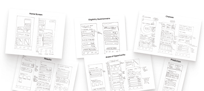
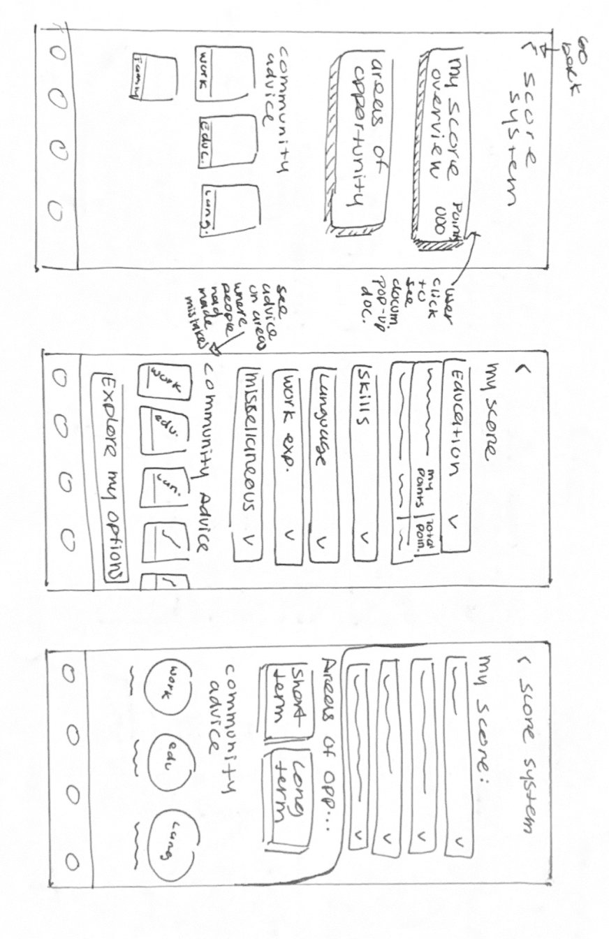
Exploratory Sketches
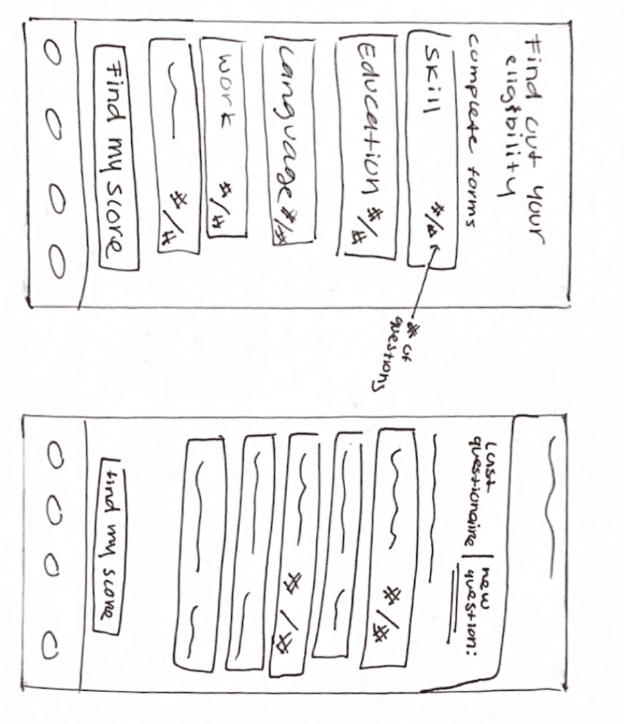
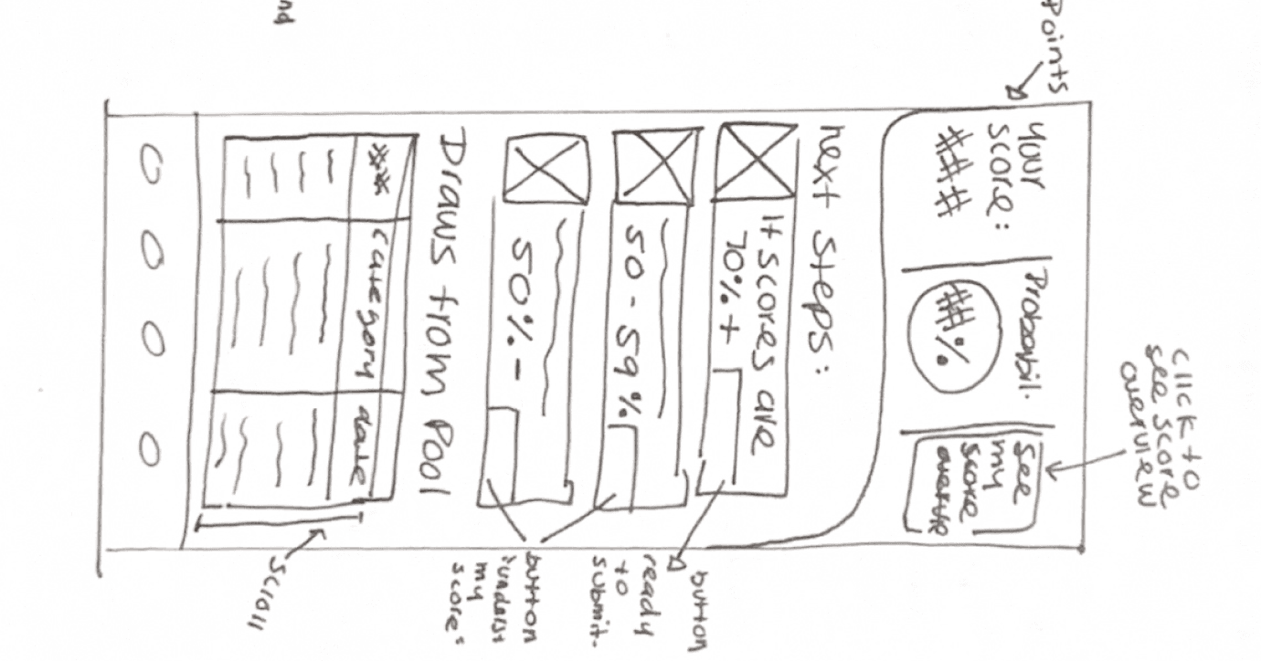
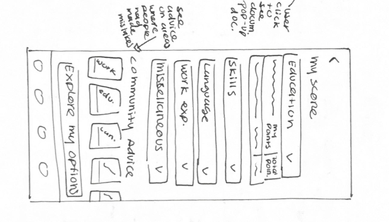
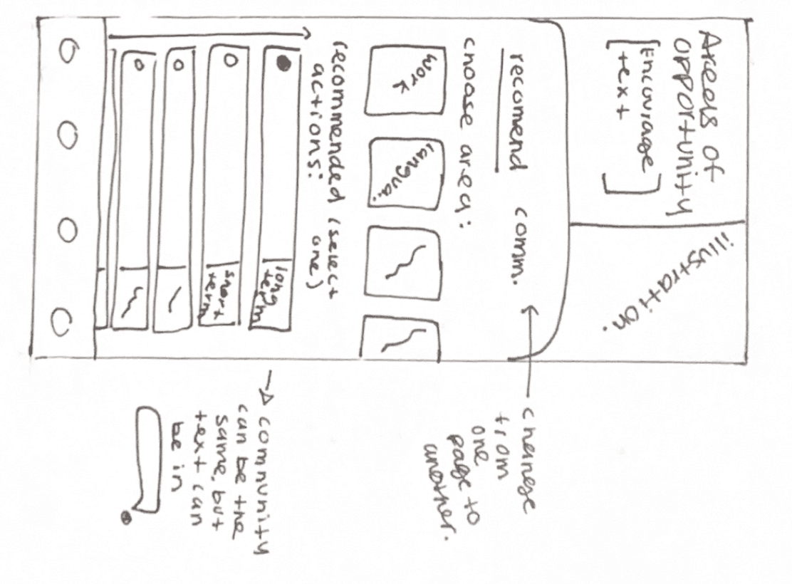
Eligibility Questionnaire
Results
Areas of Opportunity
Home Screen

Prediction
Chances
Solution Sketches
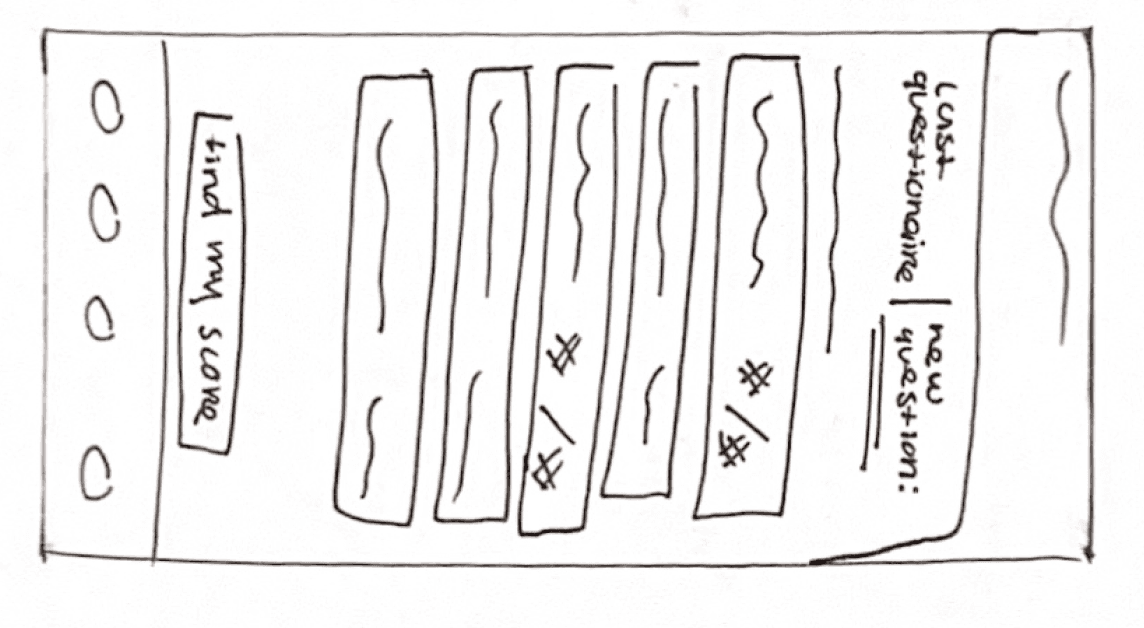


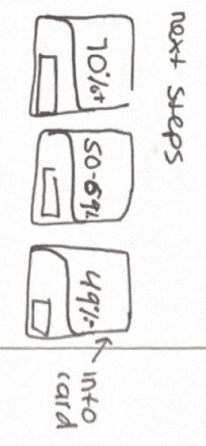


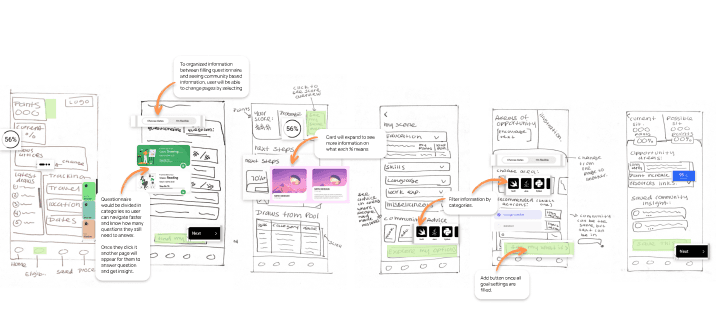
Questionnaire would be divided in categories so user can navigate faster and know how many questions they still need to answer.
Once they click it another page will appear for them to answer question and get insight.
To organized information between filling questionnaire and seeing community based information, user will be able to change pages by selecting
Card will expand to see more information on what each % means
Filter information by categories.
Add button once all goal settings are filled.
Action buttons that take the user to the next page.
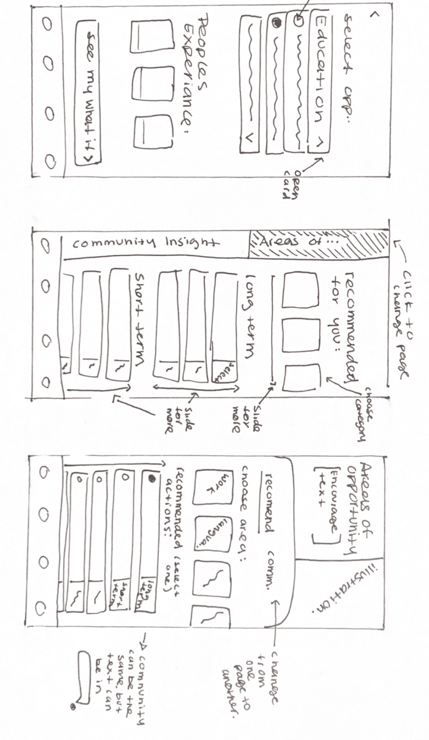
Exploratory Sketches
Eligibility Questionnaire
Results
Areas of Opportunity
Home Screen
Prediction
Chances
Solution Sketches
Questionnaire would be divided in categories so user can navigate faster and know how many questions they still need to answer.
Once they click it another page will appear for them to answer question and get insight.
To organized information between filling questionnaire and seeing community based information, user will be able to change pages by selecting
Card will expand to see more information on what each % means
Filter information by categories.
Add button once all goal settings are filled.
Action buttons that take the user to the next page.
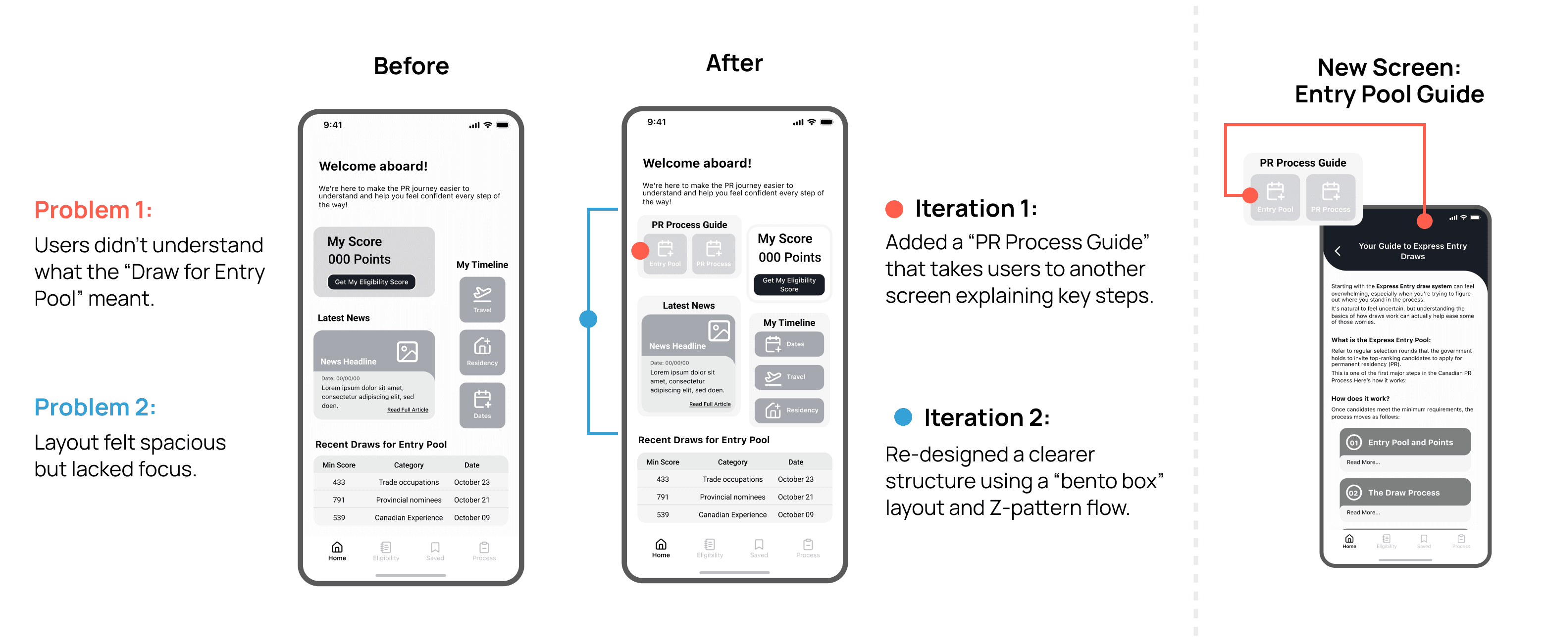
Running Into Issues: Rethinking the Flow
While wireframing, I realized the eligibility questionnaire was too long for effective usability testing.

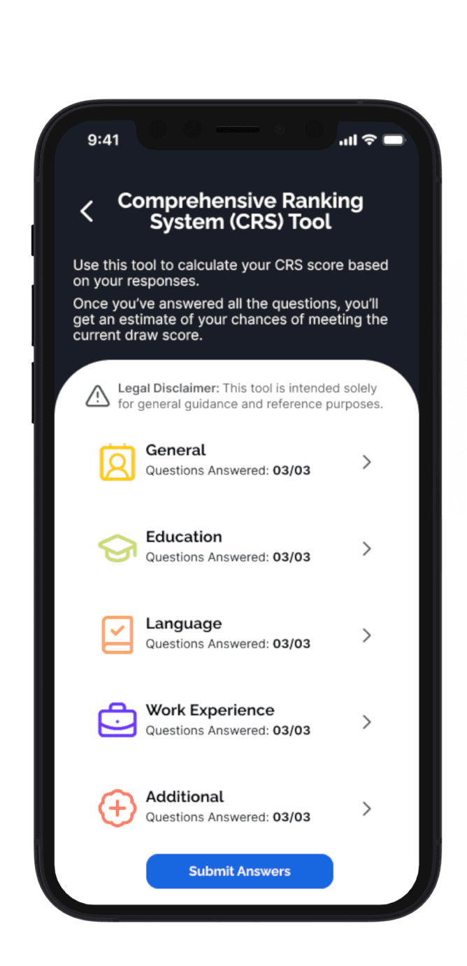
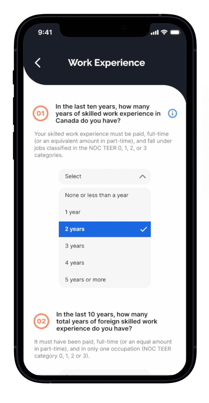
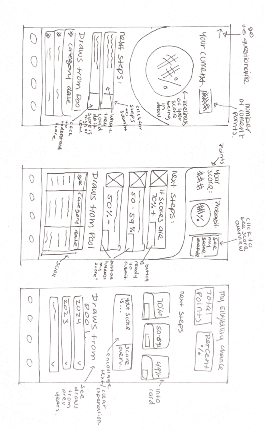
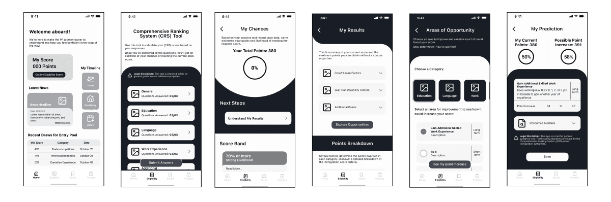
Comprehensive Ranking System (CRS) Tool
Use this tool to calculate your (CRS) score based on your responses.
Once you’ve answered all the questions, you’ll get an estimate of your chances of meeting the current draw score.

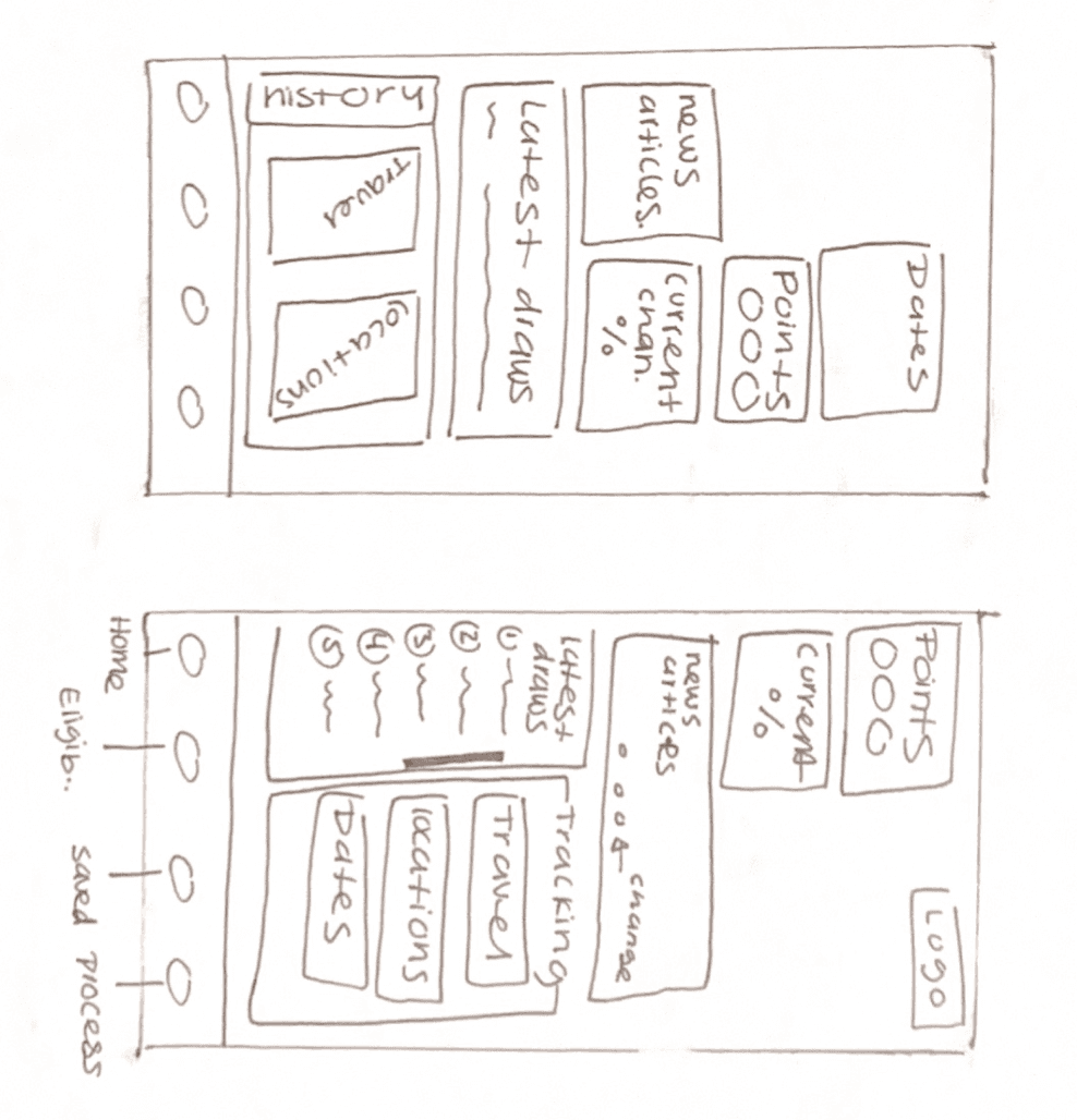
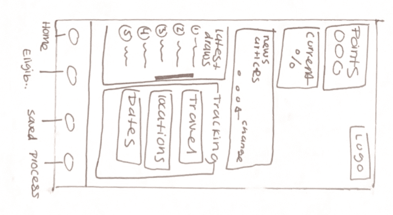
9:41
Home
Eligibility
Saved
Process
The Challenge:
The concerns I had were:
20+ minutes just to complete the questionnaire
Risk of tester fatigue and lost focus
Feedback focused only on one section instead of the full flow
Solution:
I prototyped just one category of the questionnaire to:
Keep sessions short and focused
Ensure testers experienced the full user journey
Collect balanced, actionable insights across all tasks
Low Fidelity Prototype
With the new changes, I built the first interactive prototype, setting the stage for testing and iteration.
Challenge: Design a solution that not only addresses users' pain points but creates an experience where users feel supported and not overwhelmed by large amounts of information.
Initial Prototype

Step 3: Testing
Step 3: Testing
Validating the Experience
Validating the Experience
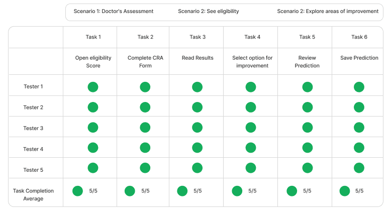
To ensure Pathway was clear, intuitive, and useful, I conducted 2 rounds of usability testing with 5 participants.
To ensure Pathway was clear, intuitive, and useful, I conducted 2 rounds of usability testing with 5 participants.
The goal: understand how well users could navigate complex information and understand their PR eligibility.
The goal: understand how well users could navigate complex information and understand their PR eligibility.
Round 1
Round 1
User Roles
Group 1

PR Immigration Process

Familiar with complex applications.
(tax forms, student loans, etc.)
Participants
Test first-time user flow and clarity
Goal:
Group 2
PR Immigration Process
Familiar with complex applications.
(tax forms, student loans, etc.)
Participants
Validate accuracy and uncover content gaps
Goal:
What I Want to Learn:
Evaluate how users navigate and understand key features.
Identify moments of confusion or friction.
Gather feedback to improve clarity and usability.
Understand users’ emotional responses.
User Roles
Group 1
PR Immigration Process
Familiar with complex applications.
(tax forms, student loans, etc.)
Participants
Test first-time user flow and clarity
Goal:
Group 2
PR Immigration Process
Familiar with complex applications.
(tax forms, student loans, etc.)
Participants
Validate accuracy and uncover content gaps
Goal:
What I Want to Learn:
Evaluate how users navigate and understand key features.
Identify moments of confusion or friction.
Gather feedback to improve clarity and usability.
Understand users’ emotional responses.
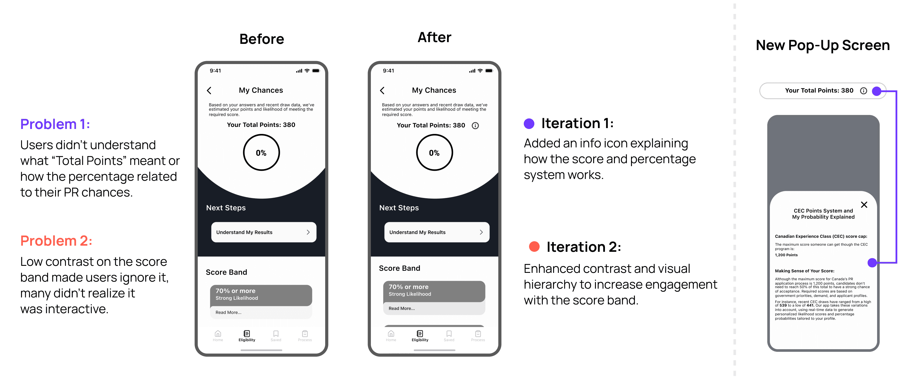
What I Learned:
Most users completed tasks successfully.
Confusion around the meaning of “Draw Pool”.
UI concerns surfaced on Home and My Prediction pages.
Low visibility in some areas; minor auto-layout issues affected interaction.
Users noted there was a lot of content, but it didn’t feel overwhelming.
Test Results

Building a Strategy:
Based on tester insights and task results, I focused on:
Fixing dropdown card malfunction
Improving text contrast for accessibility
Adding information to improve score comprehension
All key concerns from usability testing were addressed in this round.
Prioritization Matrix

What Changed? Main Iterations Based on Insights
Round 2
I updated the prototype based on Round 1 findings and tested it again with 5 participants.
What I Want to Learn:
Validate changes from previews testing.
Evaluate information clarity and flow from new use.
Compare experience between returning and new participants.
User Roles
Group 1
PR Immigration Process
Familiar with complex applications.
(tax forms, student loans, etc.)
Participants
(2 returning)
Test accessibility, ease of use, and learning curve.
Goal:
Group 2
PR Immigration Process
Familiar with complex applications.
(tax forms, student loans, etc.)
Validate clarity and completeness of updated content
Goal:
Participants
(1 returning)
What I Learned:
All users completed tasks without difficulty.
Updated content improved clarity and comprehension.
Better contrast and layout refinements improved usability.
Users still questioned the Home and My Prediction page layouts.
Test Results
Building a Strategy:
Based on tester insights and task results, I focused on:
Improving contrast and visual layout
Adding explanations of the immigration process
Enhancing copy for better comprehension
Due to time constraints, I prioritized changes directly tied to the core task flow and overall usability.
Prioritization Matrix

What Changed? Main Iterations Based on Insights
Round 2
I updated the prototype based on Round 1 findings and tested it again with 5 participants.
What I Want to Learn:
Validate changes from previews testing.
Evaluate information clarity and flow from new use.
Compare experience between returning and new participants.
User Roles
Group 1
PR Immigration Process
Familiar with complex applications.
(tax forms, student loans, etc.)
Participants
(2 returning)
Test accessibility, ease of use, and learning curve.
Goal:
Group 2
PR Immigration Process
Familiar with complex applications.
(tax forms, student loans, etc.)
Validate clarity and completeness of updated content
Goal:
Participants
(1 returning)
What Testers thought about Pathway

Validating Impact Through User Feedback
While Pathways isn’t a live product, usability testing and interviews revealed signs of value and potential impact:
100% Task Completion
Every tester completed key flows, no matter their experience level.
Real-World Relevance
Testers said they’d use Pathways or recommend it to others.
Emotional Impact
All participants felt more informed and less stressed after using it.
These insights confirmed I was on the right track. Pathways brought clarity and confidence to users. With that, I was ready to move into high-fidelity prototyping.
Step 4: Visual Design
Step 4: Visual Design
From Brand Foundations to UI System
From Brand Foundations to UI System
With insights from user testing, I moved into high-fidelity prototyping, focusing on a visual language that felt intuitive, trustworthy, and WCAG 2.1 AA and ADA compliant.
With insights from user testing, I moved into high-fidelity prototyping, focusing on a visual language that felt intuitive, trustworthy, and WCAG 2.1 AA and ADA compliant.

From Style to System
To keep Pathways consistent and scalable, I developed a UI Library based on atomic design principles:


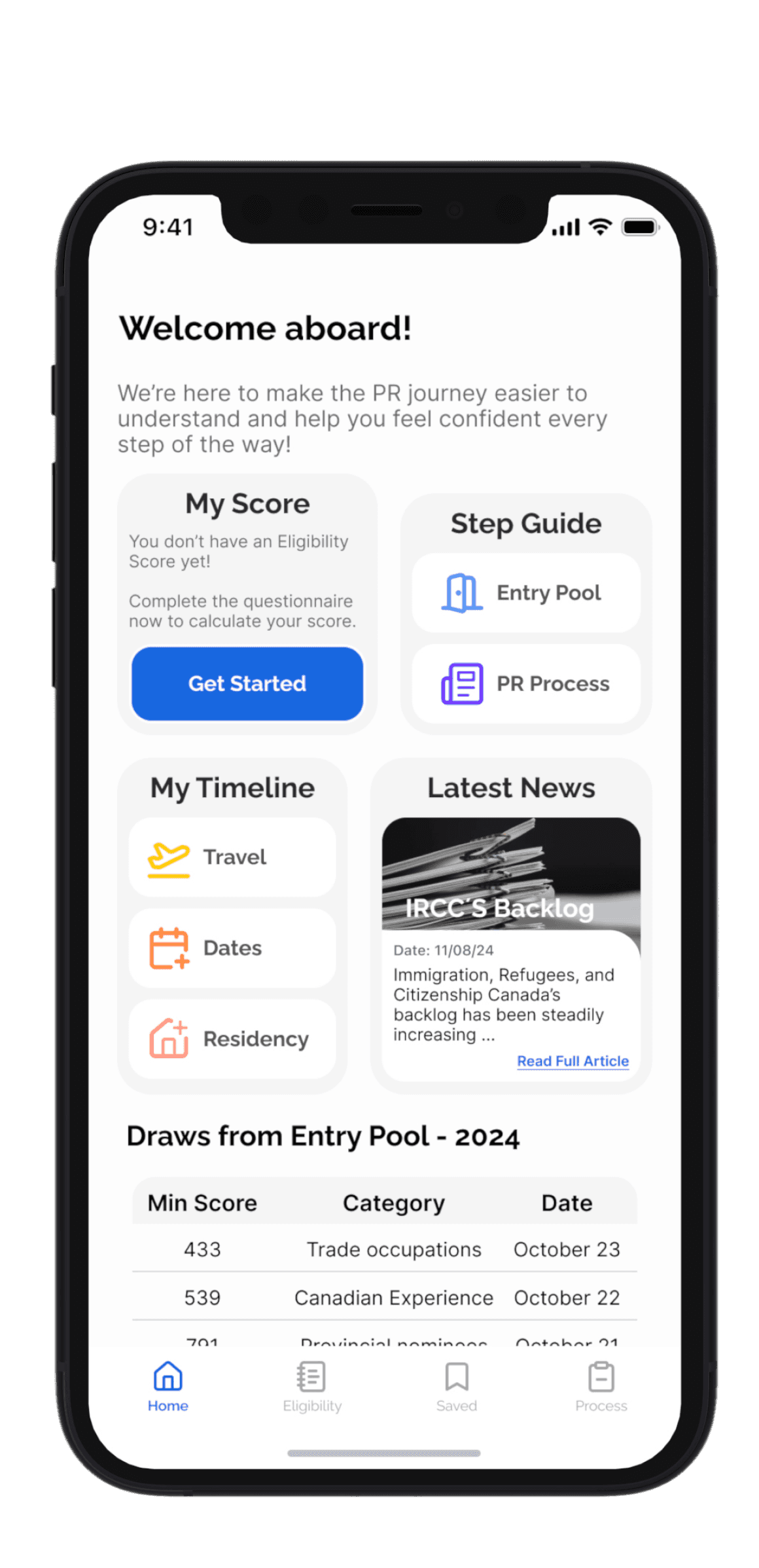
Step 5: Solution
Bringing It All Together
I incorporated branding elements and addressed user testing feedback to create the final prototype.
Have fun exploring the prototype!
Note: To complete the task flow, when you reach the "Choose Your Areas for Growth" step, select "Work for 1 more year" under the Work category to proceed to the final step.
Prototype not showing? Access file here.
Step 5: Solution
Bringing It All Together
I incorporated UI element and Visual design to bring Pathway to life.
Try it Out!
Ready to start your journey towards Permanent Residency?
to navigate prototype
R
to restart
Note:
When you reach “Choose Your Areas for Growth,” select “Work for 1 more year” under the Work category to proceed to the final screen.
Prototype not showing? Access file here.
Conclusion
Pathways helps users like Natalia navigate the PR process with clarity and confidence. It doesn’t replace legal advice but offers step-by-step guidance helping users avoid mistakes, understand requirements, and make informed decisions based on their personal eligibility.
Key Learnings
Reduced user pain points by designing within real-world constraints
Maximized research insights by adapting task flows to stay focused on what mattered most
Simplified complex information through interactive elements and supportive language to reduce cognitive load and user stress
Next Steps
Conduct further user testing to evaluate how users respond to the updated visual identity and changes from user testing
Expand the experience beyond PR eligibilty to the rest of the immigration process.
Explore progress graphs to visually show how specific actions increase eligibility
Conclusion
We where able to create a design solution that helps users like Natalia navigate the system with more confidence. While taking into consideration our limitations as we are not immigration lawyers nor can we predict policy changes.
Key Learnings
Designed solutions within constraints to effectively address and reduce user pain points.
Recognized the need to adapt plans quickly when faced with time limitations, ensuring project goals remain achievable.
Compensated for changes with thoughtfully planned and well-justified alternatives.
Found that interactive elements, clear workflows, and encouraging language greatly enhance usability and user engagement.
Next Steps
Conduct user testing to evaluate how users interact with the app and gather actionable insights for refinement.
Expand the user experience to continue beyond receiving the PR invitation, offering a more comprehensive solution.
Reevaluate the potential addition of community insights by testing their value and impact to determine if they should be integrated.
Explore incorporating a graph to visually represent the increase in eligibility points based on tester feedback, enhancing user comprehension.