Table of Contents

Table of Contents

Role

UX & UI Designer

Reading Time

5 min

Timeline

Nov 2024

Tools

Figma

Method

UI Design

Usability Heuristics

Design Strategy

Branding Guidelines

A collaborative project to conduct a heuristic evaluation and deliver design solutions to improve LinkedIn Learning's user experience and functionality.

A collaborative project to conduct a heuristic evaluation and deliver design solutions to improve LinkedIn Learning's user experience and functionality.

Role
UX & UI Designer
Reading Time
5 min
Timeline
Nov 2024
Tools
Figma
Role
UI Design
Usability Heuristics
Design Strategy
Brand Guidelines

Context

The Value of LinkedIn

LinkedIn is widely recognized as a leading professional networking platform, offering a variety of features to help users achieve their career goals. From job postings and professional connections to online courses and even interactive tools.

Context

The Value of LinkedIn

LinkedIn is widely recognized as a leading professional networking platform, offering a variety of features to help users achieve their career goals. From job postings and professional connections to online courses and even interactive tools.

Objective

Conduct a heuristic evaluation and provide targeted recommendations to enhance the user experience of a specific task flow on the iOS mobile app.

Goal

Deliver actionable solutions to improve usability, streamline the design, and promote user engagement to LinkedIn.

Step 1: Process

Laying the Foundation

We first explored LinkedIn's brand identity and user interface, focusing on key features like job search, LinkedIn Learning, posts, and profile navigation to identify opportunities for improvement.

Why LinkedIn Learnings

We focused on LinkedIn Learning because we faced challenges navigating its features. One of us was initially unaware that the feature even existed.

Our secondary research revealed LinkedIn's strong commitment to providing educational resources, which are largely underutilized.

In 2024 LinkedIn had a value of $29.99 billion with over 1 billion members across 200+ countries.

In 2015 LinkedIn acquired Lynda.com (now LinkedIn Learning) for $1.5 Billion.

With 24,000+ courses, LinkedIn Learning only has 27 million active users.

Task Flow Focus

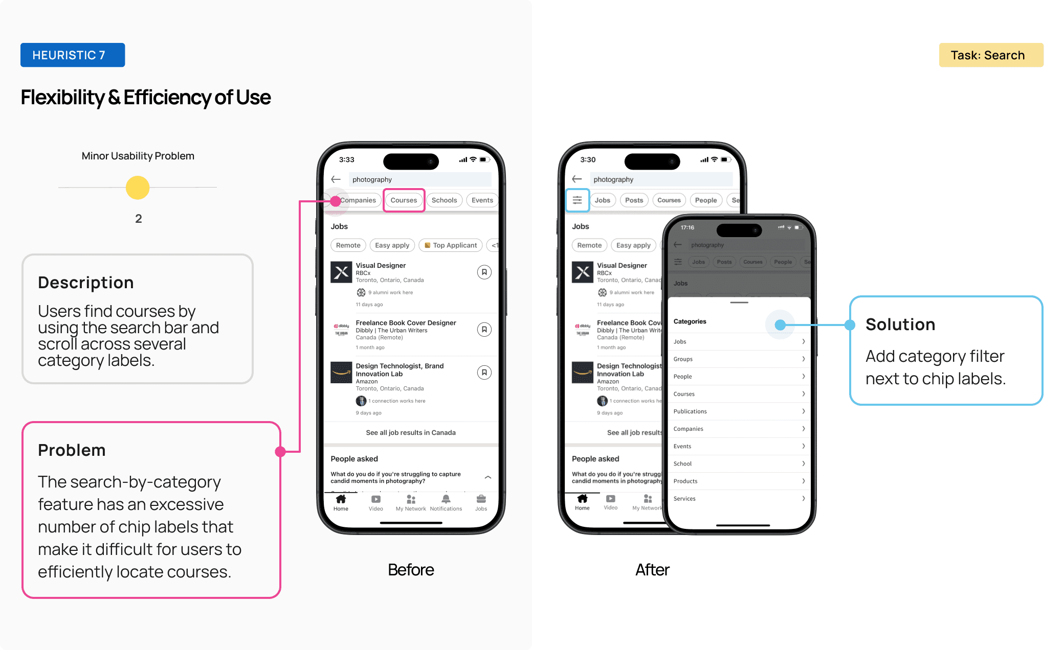
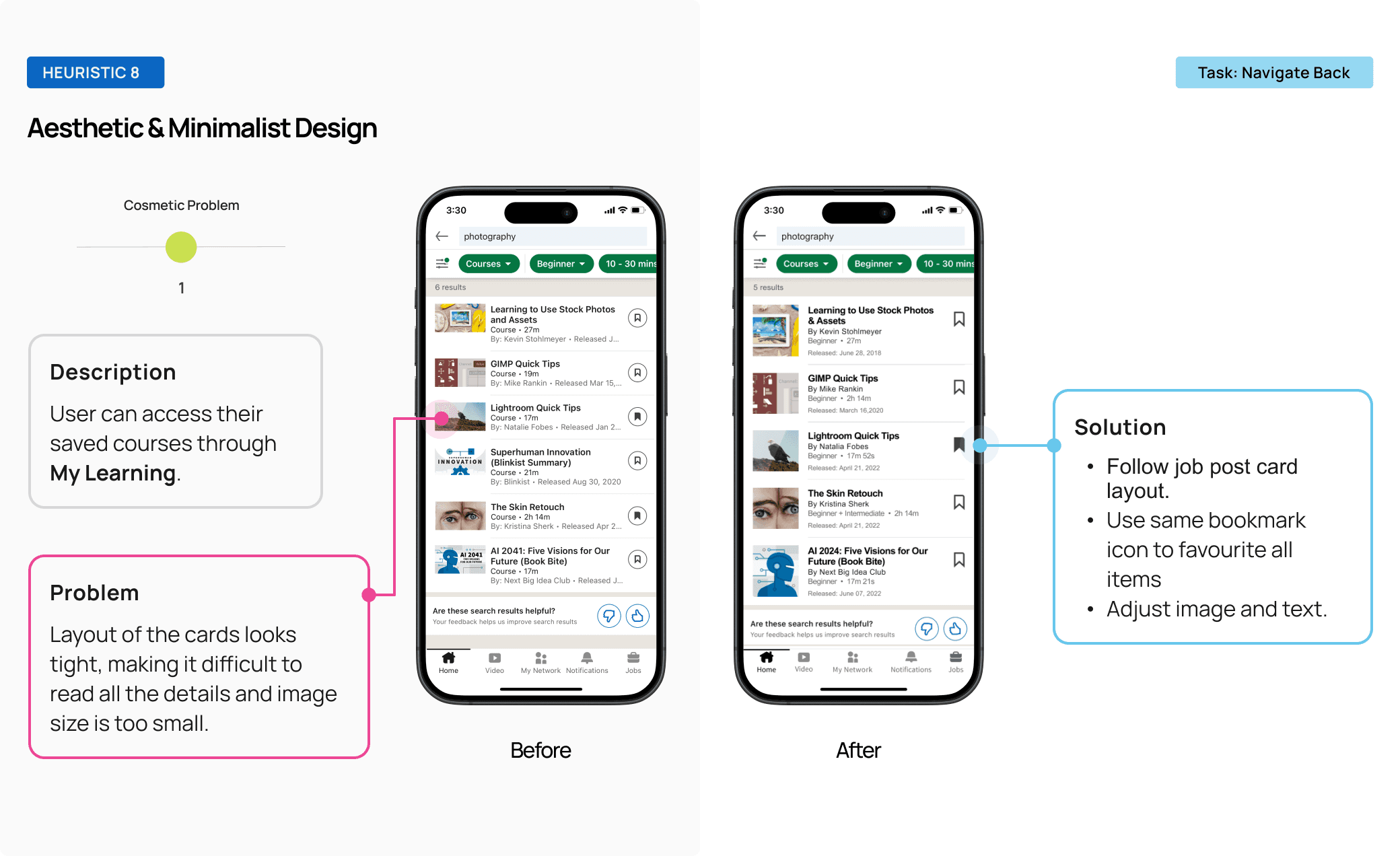
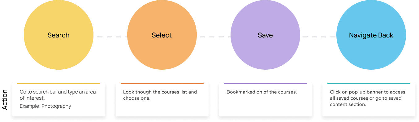
After exploring all options, we decided to concentrate on the LinkedIn Learning feature, specifically the process of finding a course, saving it, and navigating back to it.

Recognizing this as a significant opportunity to increase user engagement, we aimed to improve access to this valuable tool, empowering users to enhance their skills and boost their competitiveness in the job market.

Recognizing this as a significant opportunity to increase user engagement, we aimed to improve access to this valuable tool, empowering users to enhance their skills and boost their competitiveness in the job market.

Step 2: Design Strategy

Building a Thoughtful Approach

Building a Thoughtful Approach

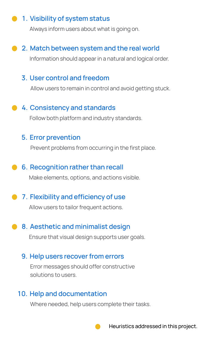
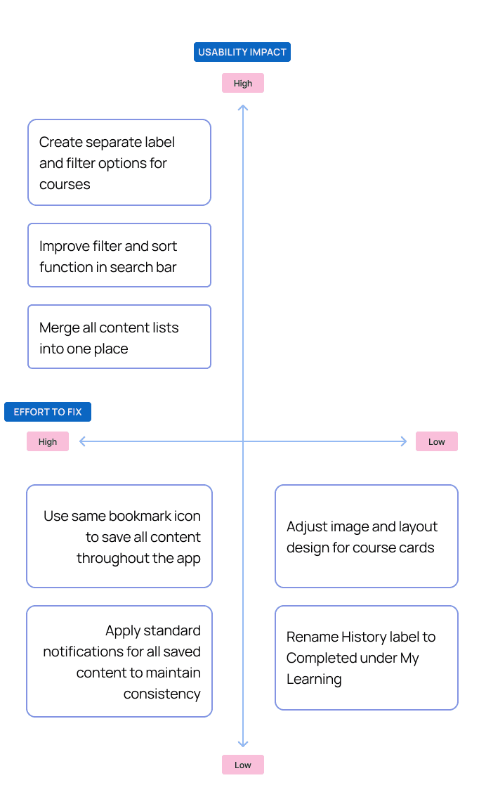
We assessed the task flow using Nielsen Norman Group’s 10 Usability Heuristics and identified 6 key issues. We then applied a prioritization matrix to rank and address the most critical changes.

With a clear direction, we were ready to start our proposal.

Step 3: Brand Guidelines

Building a Cohesive Design

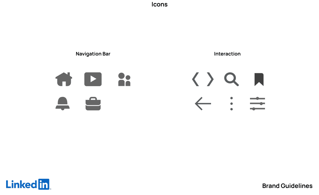
During the process, we also gathered LinkedIn's brand guidelines to ensure our solutions aligned with their identity.

Note:
Although Source Sans is the primary brand font, we observed that Arial was used in the UI of the iOS mobile app. To maintain consistency with the existing interface, we opted to use Arial in our design.

Step 4: Findings & Solutions

From Heuristics to Solutions

Here is the evaluation of LinkedIn Learning's user experience, along with proposed solutions to address key usability issues and improve overall functionality and engagement.

Our Proposal

Step 5: Reflection & Future Direction

Closing Remarks

Conclusion

In just two weeks, my partner and I developed a design solution aimed at maximizing LinkedIn's $1.5 billion investment in educational resources and fostering a more engaged learning community. Our approach focused on simplifying navigation, ensuring interactions and interface aesthetics aligned with LinkedIn's existing design, and improving accessibility by providing direct access to courses.

We believe these solutions will not only support LinkedIn's mission to empower professionals but also increase user activity. This will enable individuals to leverage the platform's resources to enhance their skills and achieve their career aspirations.

Key Learnings

  • Simplicity Over Complexity: Most heuristic violations require straightforward solutions, such as standardizing existing design elements.


  • Brand Familiarity: Even familiar products can reveal opportunities for improvement when thoroughly explored. Initially, we intended to focus on job search features but identified LinkedIn Learning as a greater area of opportunity.


  • Strategic Collaboration: A clear prioritization strategy ensures efficient task management and facilitates teamwork.

Next Steps

  • User Testing: Measure engagement metrics over six months post-implementation to evaluate improvements. For instance, determine if the 95% non-usage rate of LinkedIn Learning decreases significantly.


  • Primary Research: Investigate other factors contributing to low engagement, such as accessibility, user awareness, or content discoverability.


  • Language Consistency: During our evaluation, we observed inconsistencies in language settings. The Spanish version mixed English and Spanish, which confused users. Exploring language barriers could improve engagement in non-English-speaking regions.

Step 5: Reflection & Future Direction

Closing Remarks


Conclusion

In just two weeks, my partner and I developed a design solution aimed at maximizing LinkedIn's $1.5 billion investment in educational resources and fostering a more engaged learning community. Our approach focused on simplifying navigation, ensuring interactions and interface aesthetics aligned with LinkedIn's existing design, and improving accessibility by providing direct access to courses.

We believe these solutions will not only support LinkedIn's mission to empower professionals but also increase user activity. This will enable individuals to leverage the platform's resources to enhance their skills and achieve their career aspirations.

Key Learnings

  • Simplicity Over Complexity: Most heuristic violations require straightforward solutions, such as standardizing existing design elements.


  • Brand Familiarity: Even familiar products can reveal opportunities for improvement when thoroughly explored. Initially, we intended to focus on job search features but identified LinkedIn Learning as a greater area of opportunity.


  • Strategic Collaboration: A clear prioritization strategy ensures efficient task management and facilitates teamwork.

Next Steps

  • User Testing: Measure engagement metrics over six months post-implementation to evaluate improvements. For instance, determine if the 95% non-usage rate of LinkedIn Learning decreases significantly.


  • Primary Research: Investigate other factors contributing to low engagement, such as accessibility, user awareness, or content discoverability.


  • Language Consistency: During our evaluation, we observed inconsistencies in language settings. The Spanish version mixed English and Spanish, which confused users. Exploring language barriers could improve engagement in non-English-speaking regions.